
The Whole Truth
The Whole Truth (formerly And Nothing Else) aims to rebuild the world’s trust in food, through 100% clean food products, honest packaging and creating educational content about food and fitness.
Over the last three years, we’ve worked as design partners with the founder Shashank Mehta and The Whole Truth team to create the new brand identity and it’s evolution.
From the naming and identity design to the launch of various new product ranges across categories, we worked together to build a distinct presence and aesthetic in the world of packaged food.
While the project had a wide range of products we as a studio had worked on, here are a few of the aspects of the project that I was personally involved in.
Building the Brand Purpose
We recognised that a rebrand would not be as meaningful, had a purpose for the brand not been set. We therefore set out to establish the reason for the brand to exist, and built the brand on that one singular purpose


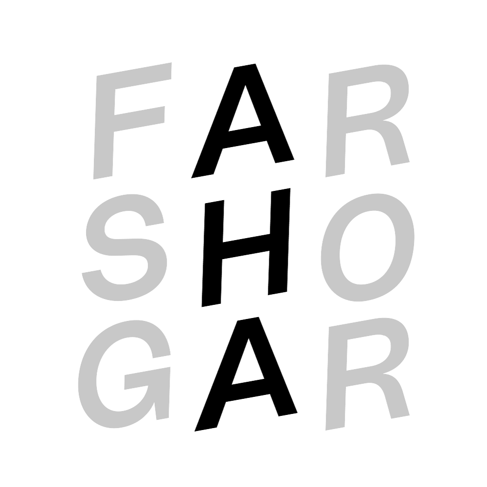
Brand Identity
The brand was renamed to capture the larger purpose that the brand set out to fulfill: Being honest about about not just the ingredients, but everything. With this intent, The naming focused on cues of honesty and transparency.
While other brands tell you some versions of ‘The Truth’, this brand aimed to add the word ‘Whole’ to paint the bigger (and honest) picture. We translated this concept into the word mark and it became the core principle of the brand identity.
Visual Language
We designed the new identity around the concept of a ‘good kind of vandalism’, since the brand was already known for identifying and marking up half-truths or false claims found on food packaging, to build the whole picture for their consumers.

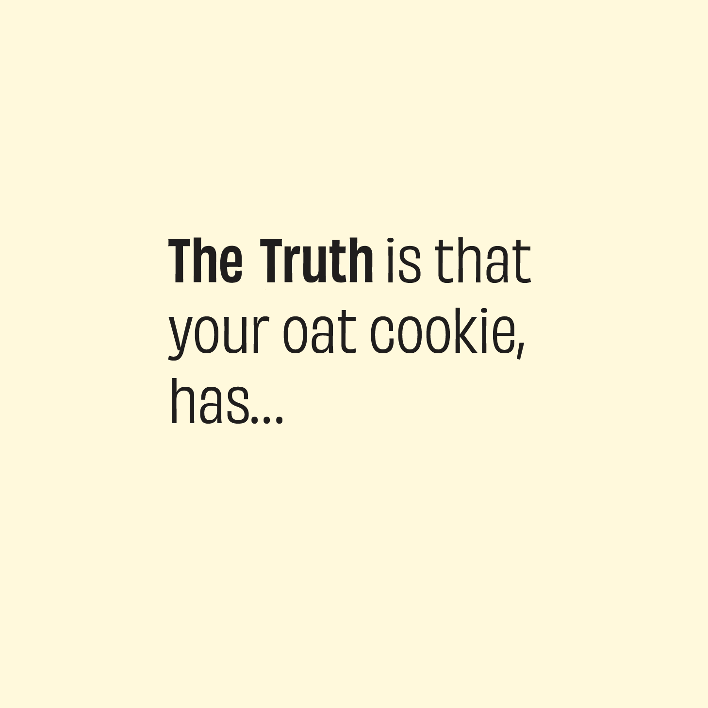


The annotated visual language would not just be present in their digital communication, but an animation style was also set for the visual language.
Produced by Harkat Studios. Written by Shashank Mehta.
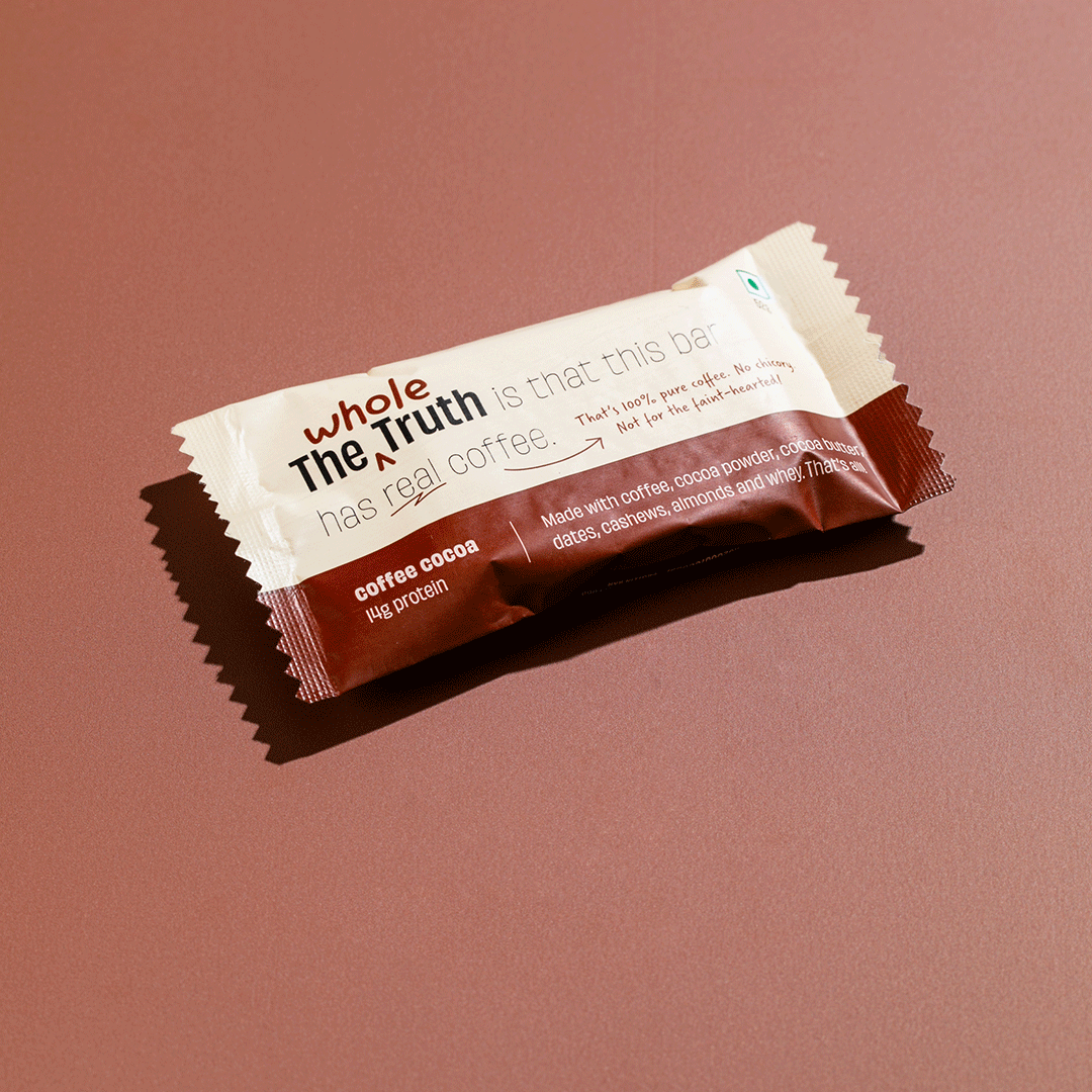
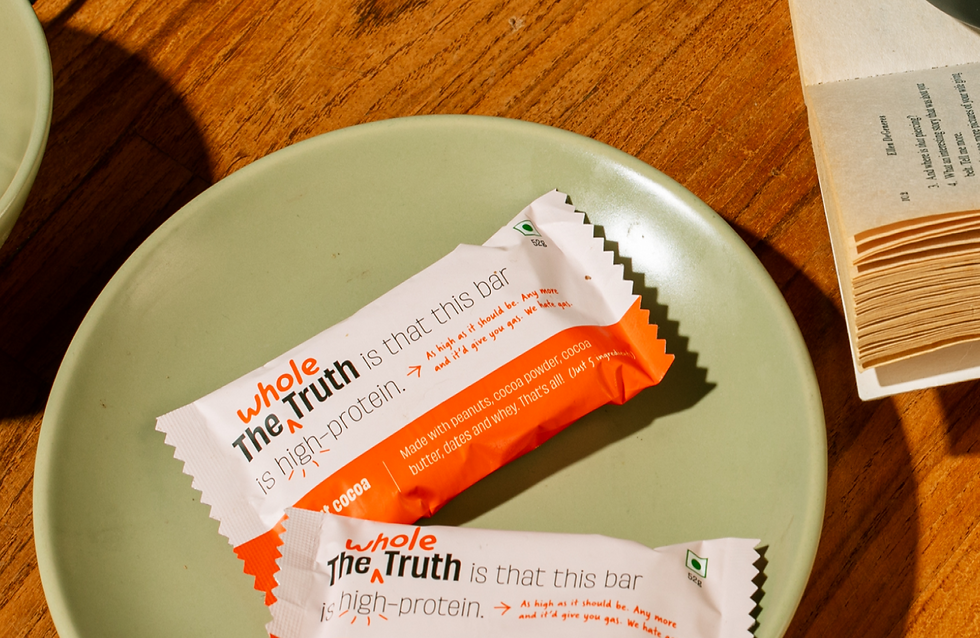
The Protein Bar
Protein bars were the first flagship product range of the brand, and the new identity launched with the refreshed protein bar packaging design.
We designed these bars with a clean, typography led approach with ‘Truth Statements’ for each variant. This system continued for some of future ranges as well.


The Ultrahuman Bar
The brand often collaborates with brands with similar purposes on limited edition products. This particular collaboration was with Ultrahuman, a cutting edge health optimization firm, uses continuous glucose monitors to measure glucose levels & insulin response to nutrition & exercise and hence fine tune a diet & activity plan customized for each individual.
With a strong visual system in place for the packaging, creating collaborative designs do not get confusing for the consumers.


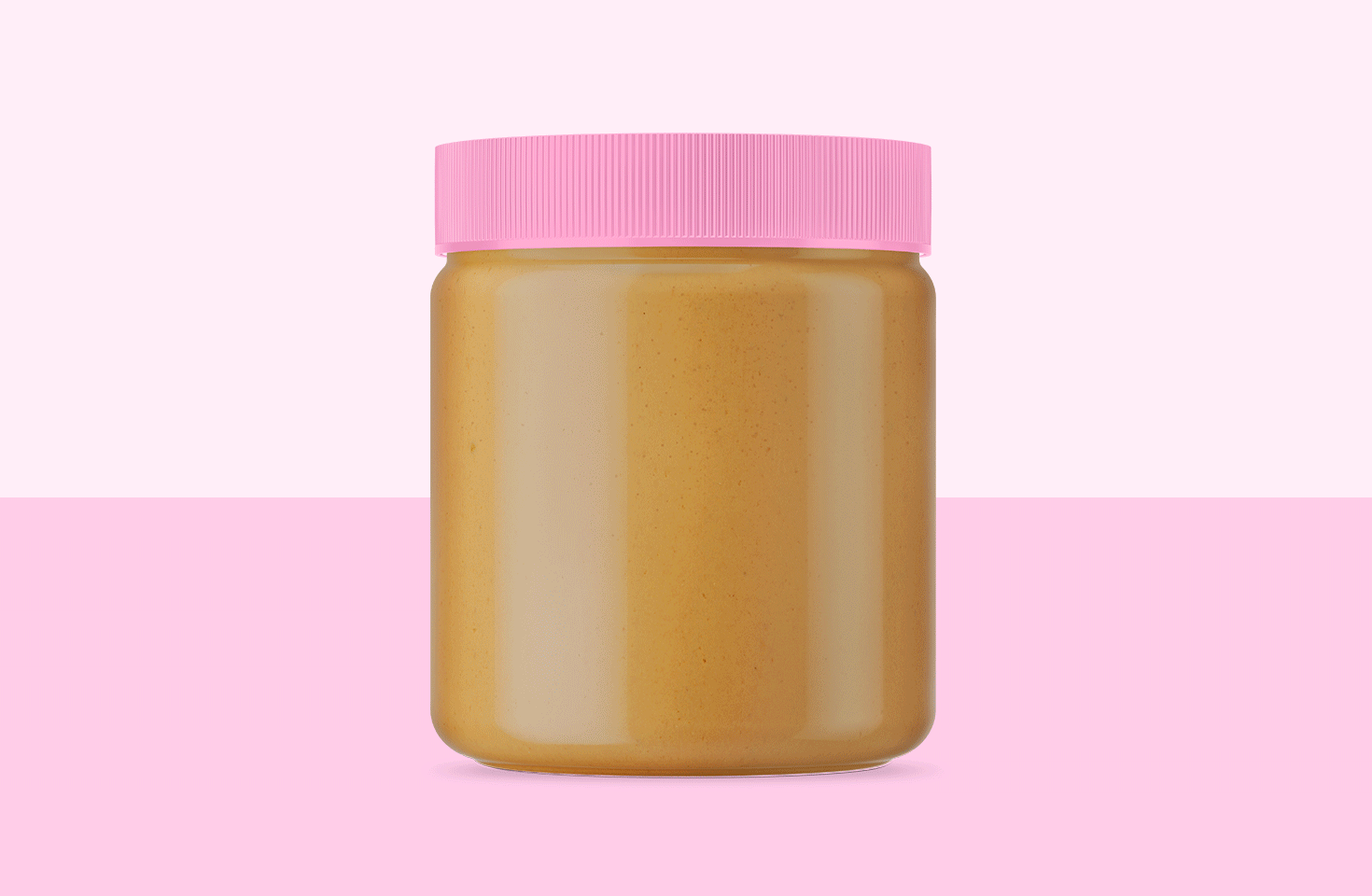
Nut Butters
The brand very soon expanded into a wide range of foods made without any added chemicals using 100% natural ingredients.
They launched their range of nut butters that are made using just 1 to 3 ingredients - peanuts, sweetened by dates, and with cocoa for a chocolate spread!


We retained the visual system of the protein bars packaging, translating it to the form of a peanut butter jar


E-Commerce Website
The website for the brand was designed to be a mobile first site. Taking cues from the visual language of the brand, we created a D2C ecommerce site that is uniquely TWT in it’s experience.